
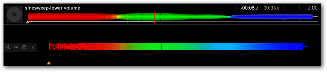

If I had to guess, and based on the "hourglassing" of the upper waveform, I'd say it comes out like that because the audio of the preview is calculated based on those three different frequency bands around a loudness countour.
Think of it as a L/M/H crossover EQ; the low frequencies go from 20-200Hz, mid from 200-5000Hz, high from 5-20kHz. The narrower portions are in / around those transition areas, and while my values are purely speculative (more likely there is overlapping in those ranges to provide the yellows and cyans in between), you can certainly see from the image that it's pretty defined RED // GREEN // BLUE with very little fading between. If there were wider overlap in the frequency analysis, it would look like a full-on rainbow, as a frequency of 20Hz would be pure red, 2000Hz would be closer to pure green, meaning half way (logarithmically) would make it yellow - a prefect mix.
So what you're not seeing visually in the colours, is also what I expect is happening with the amplitude measurement at that frequency; that frequency is near the end of the measurable limit of that "band," and thus there is some taper.
As I alluded to at the start, loudness doesn't follow a straight line - perceived loudness actually varies quite a bit:
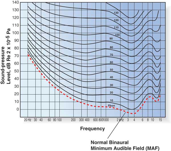
If I look at the curves in that graph, I see similar "thickening" of the waveform in your upper wave image. It could be that's how it's measured and displayed.